So you have resized your browser and found responsive website pages adjusting according to the size?
You are happy because you believe that your website is now ready for mobile devices and you think you have achieved all your website design goals.
Let us be more frank before discussing further. You are actually losing users and even sales if your goals are all about responsive web design. However, you can do it well.
Since the 2000s, developers and designers have been offering responsive web solutions to simplify the problem. Likewise, people now perceive responsive website is the one-shot solution to all their issues.
Above any other goal, it is universal fact that mobile web should be fast and smoother. Today, delivering the smoother, fast and reliable user experience to all the mobile users has been a big challenge for marketers, especially when it comes to implementing a technique of responsive web.
In simple words, responsive website design is good, but it cannot be a silver bullet. If you rely only on responsive web design for mobile, even a performance issue can hinder the conversion. Today, over 11% of websites in the world are responsive. So, let’s talk about it!
If you have really an amazing dynamic website which has all the relevant content but still not enough to get business, it’s time to make changes to your digital marketing strategy.
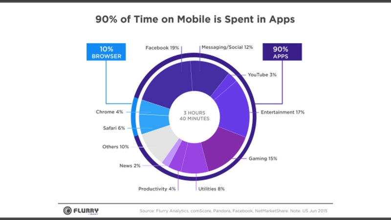
These days, everyone is looking forward to making their website mobile-friendly so it appears well. But it is not enough to take your digital strategy to another level. According to a research, customers spend around 89% of their media time on mobile apps worldwide, for using most popular apps for news, email and social network.
90% of App Usage vs. Browsers in Mobile Devices

According to the reports, users spent up to 82% of media time to access services on smartphones in 2012. According to a recent data from Flurry analytics of Yahoo, users spend over 90% of the time in apps.
Get a mobile app that generates significant revenue!
We live in an App World and the whole Web Resides here. So, if you still rely on the responsive website, you are losing up to 90% of target users on the web for just 10% of user time.
Here are the Main Reasons why Responsive Website is not Worth It
The Quick Fix
Initially, responsive web design was considered as a “First Aid” solution, a quick fix for website owners who were trying to attract more new users. This approach just focuses on turning a traditional old-fashioned website into a mobile friendly one. But as smartphones become too common, it becomes more important to provide a complete mobile platform.
Unable to Deal with Content Problems

In responsive web design, content is one of the major issues. These days, content is just rearranged as per the screen size of mobile devices. So, it is important to make a complete mobile web strategy, instead of just focusing on mobile-based perspective.
Lack of Back End Support
As of now, responsive design has no back end support. It is the worst part of it. There are chances that you will have to restructure the design to deliver content in a wide range of devices in the near future.
Performance Issues

When a site is loaded on your mobile device, it may also cause lagging issues. Due to less processing strength and slower connection, mobile devices can hardly load websites when compared to desktops. So, it is important to use cascading style sheet (CSS) for an app to run on every device.
No Native Features

Sometimes, responsive website design does not get most of the native features available on mobile devices. Using basic features like camera integration and GPS totally change the look and feel for mobile users.
Graphics & Images
Graphics and images also cause issues in responsive design as they have to be resized or scaled from the content. They sometimes take a longer time to appear and they are not suitable for mobile devices. This way, additional images are created to improve page load times, ideal UI, and adjust for the device detected.
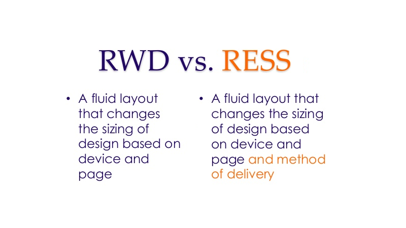
Responsive Delivery vs. Responsive website Design

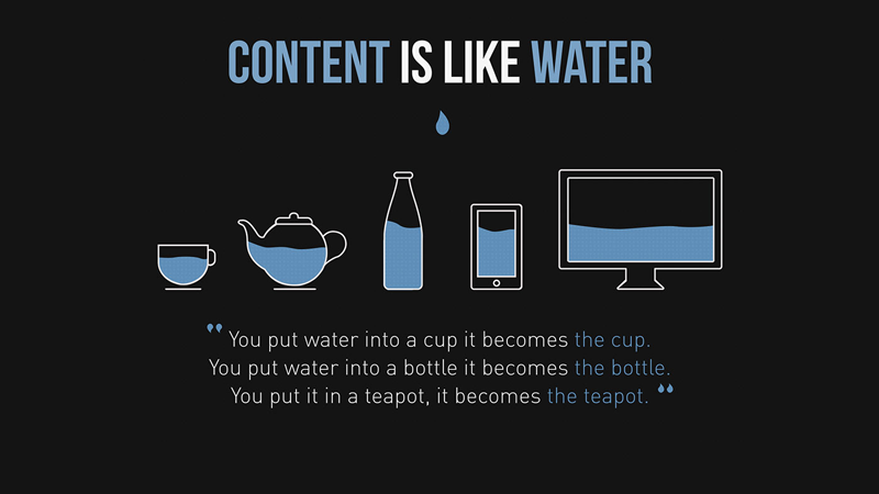
With the help of responsive delivery, the server can also detect the device and adjust the content for the device without delivering any extra data.
Menus
Instead of acclimatizing the menu with responsive design, responsive delivery creates a different mobile menu. New menus add external elements and leave unwanted pages and open maps with Google Maps and other map applications.
Text/Copy
The same text is displayed in responsive web design no matter a visitor comes from a desktop or mobile. On the other hand, responsive delivery customizes the text as per the needs of visitors and features like click-to-call.
Tooltips
The desktop versions have mouse over elements that are obviously useless for mobile users. On the other hand, one can replace these events with new image sets or components which can go well with mobile, in the case of responsive delivery.
The Solutions
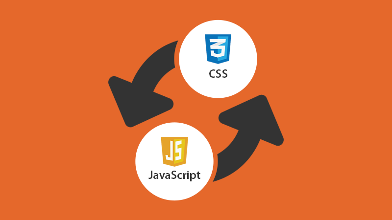
Replace CSS with JavaScript

Since browsers will parse and load all the styles and selectors for all devices, it is not wise to rely on CSS media queries always. A mobile device will parse and download the CSS to work on larger screens. CSS would waste the valuable milliseconds of the users relying on mobile data as it blocks rendering.
On the native devices, the matchMedia query won’t change. For instance, iPhone is not able to convert the page as per the size of iPad. So, it becomes important to load CSS. However, a feature detection tool like Modernizr is also used to make quick and sensible steps to improve the user interface and functionality which relies not just on dimension.
Mobile App Development

We can help you reach your desired business goal with our cost-effective mobile application development!
To address the needs of your customers, there are several invaluable tools available thanks to the advancement of technology. Since 90% of traffic comes from mobile apps, it’s time to go mobile completely with mobile app development.
The custom mobile application development can help you stand out of competition, save time to market and interact with more customers the right way. The mobile app showcases a lot of things about your business. So, you should develop a smooth and quick application for the business to reach the target audience.
Other Techniques
Well, there are some other techniques to get the most of the responsive design without having to affect its performance. Responsive web design has never been made to improve performance. So, it doesn’t make sense to blame the technique as a whole. On the flip side, assuming it to fix all the issues, as most people do, is also not good.
Responsive web design is important as we have to face several screen sizes from desktops to mobile. But considering screen size only is overlooking other aspects of increasing visibility. The line between mobile and desktop has been blurred, but there are still various possibilities as per the type of devices.
Some of the reviewers may call it just ‘responsive web design’ with modern outlook while some call it a ‘responsible responsive website design’. Without going further, be sure to understand and know the problem.
Though there is no single solution for all kinds of websites, here are few of the major tricks to maximize performance and improve responsive solutions –
- Prefer a mobile-friendly approach if you are starting from scratch.
- Each page must have the same URL for all the devices with same content. But it is not necessary to deliver it with same the structure.
- Improve and measure performance with certain optimization tools.
- Test responsiveness on real devices to see what if when applying”display: none” and when resources will load, rather than just resizing the desktop browser.
- Use the only JavaScript to deliver responsive images until you find something better from browser vendors.
- For the current device, only JavaScript must load with the conditional load, followed by “onload” event.
- Use sensible responsive web solution with the following techniques –
- Responsiveness as per the group
- Conditional loading
- Server-side layer
- Showcase above-the-fold content before others, or align initial view of pages for your target mobile devices.
The Future of Mobile Strategy
Responsive delivery is likely to become a potential solution for some of the issues in responsive design. But it cannot fix all the issues. However, it can definitely mitigate the performance issues. However, you can still find much in native features and back end support. You can rest assured that mobile technology will evolve and become the leading web strategy for many.
Verdict
We are not saying that you must go completely mobile with an “m.” subdomain and we are not against responsive web design. In fact, it is better to assign only one URL in all devices is better with the emergence of social sharing. However, it doesn’t mean you have to deliver the same thing on a single URL or that same resources must be downloaded on all devices. Having just a responsive website for your business has become the things of the past. Today, you need to perform responsive delivery of content.


