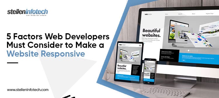
Responsive web design ensures building websites that adapt to and function well on mobile, desktops, laptops, and tablet devices. It reduces the chances of users abandoning the site and improves search engine rankings. Also, the user experience improves. Thus, resulting in higher conversions and business growth.
The website developers and designers emphasize incorporating user-facing features for the best possible performance and high-level functionality. Also, they make sure the site design is user-friendly and appealing. They oversee all areas of the website, such as coding and modification. Thus, keeping an eye on and contributing to its responsiveness and expected functionality. Once it is launched, they ensure the site content fits appropriately and is compatible with distinct devices of different screen sizes.
But the question is how web developers make a website responsive. In this article, we’ll go through the vital measures to take to carry out the objectives of the website design and evaluate its responsiveness.
Importance of Responsive Web Design
Building a website for a single device is not sufficient and optimizing it for multiple screens is essential. The reason is there are more mobile users than desktop users.
Around 57% of users do not suggest businesses with websites with poor design. Even the statistics for 2021 help to clarify the claim because they reveal that mobile devices accounted for 54.8% of all internet traffic in that year.
Hence, creating responsive websites adapting to several devices is the key. Let us discover what factors web developers implement to accomplish this.
How Web Developers Can Make a Website Responsive?
Specify the Suitable Responsive Breakpoints
What are the breakpoints? These are the points at which the website’s design and text adapt in a specific manner to deliver an outstanding user experience.
The websites are accessed by varying devices having different resolutions and screen sizes. Hence, enabling it for easy rendering across each of the devices is essential. So, images or content is not unnoticeable or seems misinterpreted.
Here, using the breakpoints or sometimes known as media query breakpoints is necessary. These are defined in the coding. The different breakpoints used for varying device resolution include:
- Desktop or laptop with high-resolution: 1920 x 1080
- Laptop: 1366 x 768
- Tablet: 768 x 1024
- Pixel 2: 411x 731
- Mobile: 360 x 640
There is no need to implement breakpoints if the website design is covered with the use of small font size and a single column.
Utilize Fluid Grid
Earlier, the appearance and navigation of websites were dependent on pixel measurements. It means the size for HTML elements was set to static pixels. However, the fluid layout is the dynamic approach to building websites that easily resize the elements depending on the screen size. It does not work on fixing the static dimensions.
The web developers work on the source code of the website to implement the fluid grid rules. Thus, ensuring the site appears consistent across several devices. Moreover, the fluid grid offers control over the alignment.
Consider the Touchscreen Functionality
Considering touchscreens is essential. After all, most of the devices these days including laptops come with both keyboard functionalities and touchscreens. For instance, the menus will appear bigger on desktops so pressing them using fingertips would be easier. On the other hand, mobile screens will display a small element size. Hence, using the CTAs and images will make it easier for the elements to easily render according to devices and screen sizes.
Images and videos also need to display seamlessly across different screen sizes. To do this, you can code the rules that determine how images should be displayed on the website.
For this, use the code rules shared below.

In this syntax, the role of:
- Max-width is to enable the image to adjust its size on the varying devices depending on the container width.
- Using source, image, and picture tags is to ensure one image is generated.
- srcset attribute informs the browser about the picture to display according to the device’s type and screen resolution.
- Using source tag means supporting the lossy compression of images required to make the website load faster.
- Lazy loading is only implemented using the loading lazy property.
Define Responsive Typography
Usually, the responsive web design’s focus is on the flexibility of media, layout, and other elements. However, web developers must focus on defining the text font sizes and pixels. It will ensure the content is easily readable and adjusts to the device’s screen size.
Here, use the following code to reset the HTML element’s font size:

Now, define multiple text elements and their font sizes:

Test Website Responsiveness on Multiple Devices
The testing phase requires considering the following queries.
- See if the layout adapts to the appropriate number of columns.
- Does the font size fit the screen sizes of varying devices?
- See if the content fits properly in the screen’s containers and the layout elements.
Besides, use the mobile-friendly test feature of Google to test responsiveness. How to use it?
Enter the website URL and hit the button “test URL” to obtain the outcomes.
In addition, you can utilize tools such as Chrome developer tools. It helps in the website testing on various screen sizes. For this, use the shortcut “CTRL+SHIFT+I” on your Windows desktop. On the other hand, for testing site responsiveness on Mac, press the “Command+Option+I” shortcut. Now, you can pick the device type to experiment with the website responsiveness.
Conclusion
Considering all these factors above and implementing them step-by-step will help in achieving a responsive website. After all, the website’s responsiveness directly enhances the user experience. Remember internet users expect the websites to function ideally on their devices, be it the desktop, laptop, or mobile. If it fails, the chances of the website losing on potential audience increase. So, simply invest your efforts into following all these tips.
Thanks for Reading!!


